


Article
From occupancy data to decisions: a workplace leader’s guide to reporting
A workplace report should do more than describe how the office was used. It should help leaders decide what to renew, resize, reconfigure or change. Here are five questions every report needs to answer, and a practical way to turn the findings into a business case.
Workplace teams can produce polished dashboards and still struggle to drive a decision. The problem is rarely a lack of data. More often, reporting stops at describing what happened: utilization was 42%, Tuesday was the busiest day, or one floor was quieter than another. Those observations may be accurate, but they do not yet tell leadership what to do.
A useful workplace report connects three things: how spaces are actually used, what that usage means in financial and operational terms, and which decision should follow. The dashboard is an interface, and the report is the argument for action.

Start with the decision, not the dashboard
Before choosing a chart or opening a reporting tool, define the decision the report is meant to support. Is the organization preparing for a lease renewal? Considering a smaller footprint? Reconfiguring a floor? Trying to solve meeting-room shortages or improve desk availability? The answer determines what evidence matters.
A strong reporting brief starts with four questions:
- What decision needs to be made?
- Who will make it, and by when?
- Which realistic options are on the table?
- What evidence would change the recommendation?
This keeps analysis focused. It also prevents a common failure mode: collecting every available metric and hoping the important message will reveal itself later.
Five questions every workplace report needs to answer
1. Does it show peak demand as well as the average?
A single average can hide the fact that a workplace runs out of space at predictable times, even though it looks comfortably underused overall. For example, an average utilization rate of 45% says nothing about whether meeting rooms are overloaded on Tuesday mornings or whether desks are difficult to find on the busiest team day.
Space has to work when demand is highest, not only when the week is averaged out. Report both average usage and peak concurrent demand, and show when those peaks occur. For larger decisions, use a distribution or a consistent percentile of peak demand rather than allowing one exceptional day to define the whole plan.
2. Does it separate different space types?
Open desks, meeting rooms, phone booths, focus spaces and collaboration areas serve different needs and follow different usage patterns. One blended figure for a building or floor can hide the fact that desks are available while small meeting rooms are constantly full.
Break the results down by space type, size, floor and zone. Where useful, compare capacity with actual group size. A ten-person room used mostly by two people is occupied, but it may still point to a mismatch in the room mix.
3. Does it state how much of the workplace was measured?
Coverage is part of the result, not a technical footnote. If sensors cover 70% of desks or only selected meeting rooms, the report must say so clearly. Otherwise, readers may assume the findings represent the entire building.
Show which spaces were included, the measurement period, any gaps in the data and whether the measured sample is representative. Do not extrapolate partial coverage to a whole portfolio unless the method and assumptions are explicit.
4. Does it measure actual use, not bookings alone?
A booking records intention. Occupancy data records what actually happened. Plans change, meetings move online and reserved rooms remain empty. If reporting relies on calendar or booking data alone, ghost bookings can make demand look higher than it is.
Booking data is still valuable: it reveals demand, user behavior and friction in the reservation process. But it becomes far more useful when compared with anonymous presence data. The gap between booked and occupied time is itself a decision-ready metric.
5. Does it provide a meaningful reference point?
A result such as “utilization was 38% last month” has no direction on its own. Compare it with a target, a previous period, a comparable floor or office, or a relevant benchmark.
Make sure the definitions match: two figures are not comparable if they use different measurement windows, coverage levels or definitions of utilization.
Make patterns visible
The best visualization is the one that makes the decision-relevant pattern difficult to miss. A calendar heatmap, for example, can reveal recurring peaks by weekday and hour far more clearly than a monthly average. A room-size comparison can show whether scarcity is caused by too little space overall or by the wrong mix of rooms.
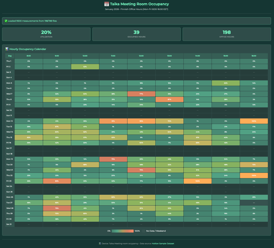
Calendar heatmap visualization of meeting room occupancy based on demo data.
The platform is not the reporting strategy
The same reporting principles apply whether workplace data is visualized in Power BI, Microsoft Places, ThingsBoard, Cisco Spaces or another analytics environment. A sophisticated dashboard cannot compensate for incomplete measurement, unclear definitions or a report that never reaches a recommendation.
At the same time, a simple leadership memo can be credible when the analysis behind it is rigorous. But simplicity should be the result of good analysis – not the absence of it.
From reporting checklist to business case
Consider a company whose office lease is due for renewal in 12 months. The workplace team has collected occupancy data over a representative period and now needs to recommend whether to renew the current footprint, reduce it or change the space mix.
The workplace and facilities team may need to examine:
- Weekly and monthly trends by building, floor and zone
- Peak-hour heatmaps by weekday
- Utilization by space type and room size
- Booked time compared with occupied time, including ghost-booking rates
- Measurement coverage, gaps and confidence notes
- Headcount, attendance-policy and growth scenarios
This level of detail is necessary for diagnosis. It helps the team distinguish between underuse, local bottlenecks and a poor space mix. But it is not the version leadership needs in the renewal meeting.
The leadership version should be built around a choice
Leadership needs a concise decision brief that translates the analysis into options, money and risk. A useful one-page version answers six questions:
- What decision is required, and by what date?
- What is the headline finding at peak demand?
- What does the current footprint cost, and which part of that cost is realistically addressable?
- What are the viable options – for example, renew as-is, reduce the footprint, or retain the footprint but reconfigure the room mix?
- What are the financial, operational and employee-experience risks of each option?
- What does the workplace team recommend, and why?
Key principle: Do not equate an empty-space percentage directly with wasted rent. First identify how much space could realistically be removed or repurposed while protecting peak capacity and workplace experience.
Translate utilization into cost – without oversimplifying
Suppose a hypothetical office has 500 workpoints and the busiest observed periods use 310 of them. The remaining capacity is a signal worth investigating, but it does not automatically mean that 38% of the lease can be removed. Circulation space, shared services, room mix, team adjacencies and future demand all affect what is truly reducible.
A defensible business case starts with the addressable area. Estimate how many square meters could be removed or repurposed under each option, multiply that by the fully loaded annual cost per square meter, and subtract the annualized costs of redesign, relocation and change. Then test the result against realistic demand scenarios, including headcount growth, attendance-policy changes and seasonal peaks.
A good report ends with a recommendation
A dashboard invites exploration. A decision brief closes the loop. It should state what the data shows, what the organization should do next, what the decision is worth and what happens if no action is taken before the deadline.
That is the real test of workplace reporting: not whether the charts are impressive, but whether leaders can use them to make a confident decision in one meeting.
Turn workplace data into decisions. Haltian Occupancy Analytics combines anonymous, camera-free occupancy sensors with real-time and historical reporting for desks, meeting rooms and phone booths.
Explore Haltian Occupancy Analytics or talk to our experts about the reporting your next workplace decision requires.